Correlation analysis in Python
What is Correlation?
- Correlation used to identify the association between variables
- Correlation of two variables (pairwise) has values between -1 (negative correlation) and 1 (positive correlation)
- Statistical tests to measure correlation: Pearson, Spearman’s rank-order, Kendall’s Tau
- In bioinformatics, correlation can be used to identify coregulated gene expression, check the quality of biological replicates, etc.
Calculating correlation in Python
- We will use
bioinfokit v0.6or later - Check bioinfokit documentation for installation and documentation
- Sample dataset used in this tutorial dataset to calculate the correlation between variables. This sample gene expression dataset contains 13324 genes and 18 variables (A to R). These variables represent the log2 expression fold changes between different treatments.
# you can use interactive python interpreter, jupyter notebook, spyder or python code
# I am using interactive python interpreter (Python 3.7)
>>> from bioinfokit import analys, visuz
# load dataset as pandas dataframe
# data should not have missing values (NaN)
>>> df = analys.get_data('corr').data
>>> df.head()
geneid A B C D E ... M N O P Q R
0 gene_11788 0.530955 0.0 0.452218 0.0 -0.081783 ... -0.055837 0.0 0.016365 0.0 0.035935 0.0
1 gene_3172 -0.100497 0.0 0.082000 0.0 0.188021 ... 0.655970 0.0 -0.181619 0.0 -0.877352 0.0
2 gene_10568 -0.037399 0.0 -0.124216 0.0 -0.082652 ... -0.063393 0.0 -0.251791 0.0 -0.227313 0.0
3 gene_7250 0.530852 0.0 1.311357 0.0 0.157159 ... 3.331255 0.0 4.121092 0.0 0.536099 0.0
4 gene_9644 -0.034391 0.0 -0.405833 0.0 -0.301649 ... 0.329918 0.0 3.076992 0.0 2.691966 0.0
[5 rows x 19 columns]
# delete identifier column
>>> df = df.drop("geneid", 1)
>>> df.head()
A B C D E F G ... L M N O P Q R
0 0.530955 0.0 0.452218 0.0 -0.081783 0.0 0.600653 ... 0.0 -0.055837 0.0 0.016365 0.0 0.035935 0.0
1 -0.100497 0.0 0.082000 0.0 0.188021 0.0 0.881326 ... 0.0 0.655970 0.0 -0.181619 0.0 -0.877352 0.0
2 -0.037399 0.0 -0.124216 0.0 -0.082652 0.0 -0.290439 ... 0.0 -0.063393 0.0 -0.251791 0.0 -0.227313 0.0
3 0.530852 0.0 1.311357 0.0 0.157159 0.0 1.738840 ... 0.0 3.331255 0.0 4.121092 0.0 0.536099 0.0
4 -0.034391 0.0 -0.405833 0.0 -0.301649 0.0 1.573004 ... 0.0 0.329918 0.0 3.076992 0.0 2.691966 0.0
[5 rows x 18 columns]
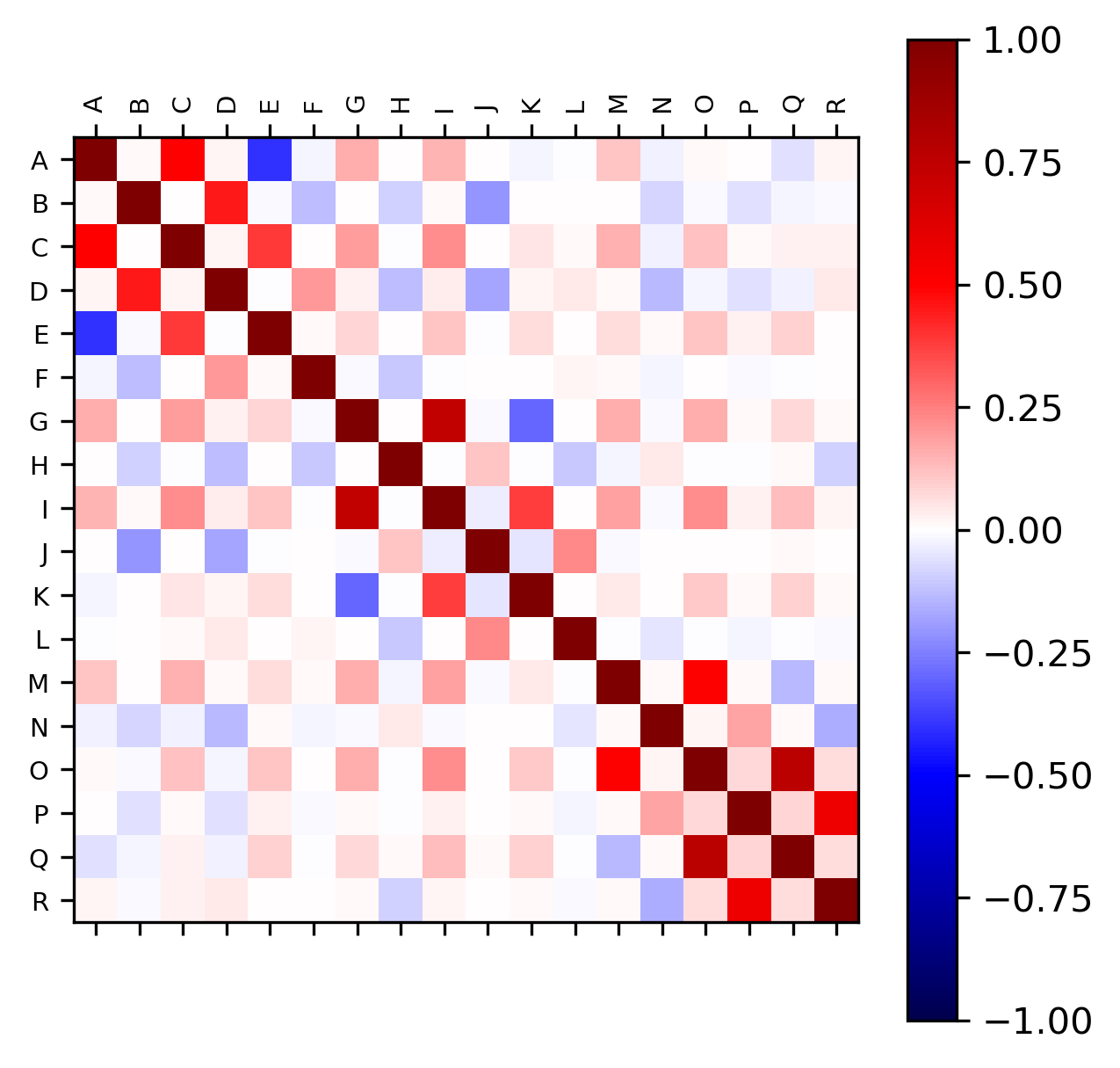
# correlation analysis plot
>>> visuz.stat.corr_mat(df=df)
# plot will be saved in same directory (corr_mat.png)
# set parameter show=True, if you want view the image instead of saving
Generated correlation plot by above code (red: positive correlation and blue: negative correlation),
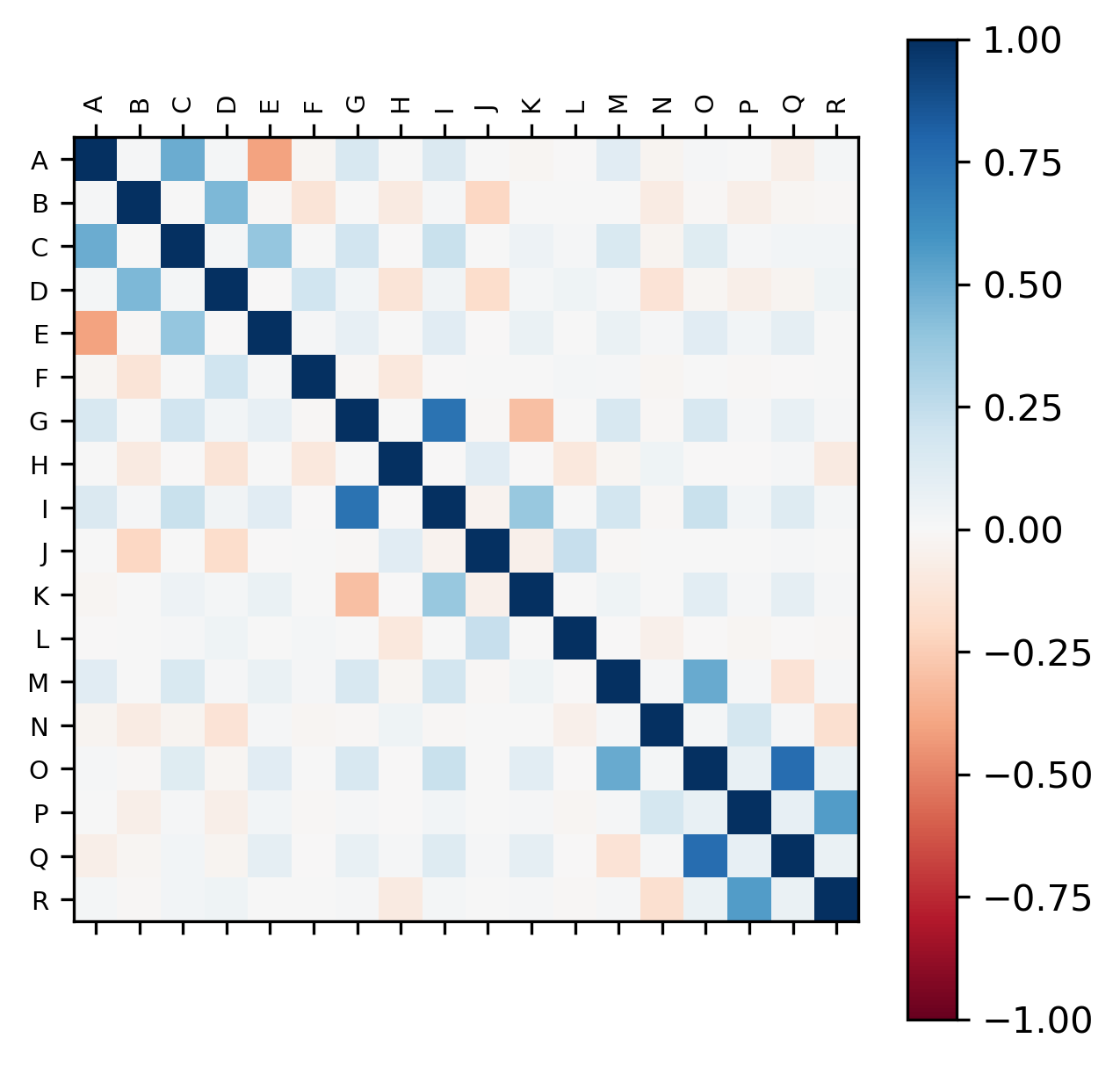
Change color of the plot
# colormaps are available at  https://matplotlib.org/3.1.0/tutorials/colors/colormaps.html
# default is seismic
# here I use red-blue: RdBu
>>> visuz.stat.corr_mat(df=df, cmap='RdBu')
Change figure format, axis tick label font name and size
>>> visuz.stat.corr_mat(df=df, cmap='RdBu', figtype='svg',
    axtickfontsize='10', axtickfontname='Verdana')

Check detailed usage
This work is licensed under a Creative Commons Attribution 4.0 International License