pheatmap: create annotated heatmaps in R (detailed guide)

Page content
In bioinformatics, heatmaps are commonly used to visualize gene expression changes across multiple genes and conditions. This article describes how to create clustered and annotated heatmaps for visualization of gene expression data obtained from RNA-seq experiments using a pheatmap R package.
Install pheatmap
If you have not installed pheatmap package, you can install it using install.packages() function.
# install pheatmap
install.packages("pheatmap")
Load pheatmap library
You need to load the pheatmap library for creating the heatmaps. I am using the RStudio console with R version 4.2.1
# load pheatmap (v1.0.12)
library(pheatmap)
Load dataset
For this pheatmap tuotrial, I will use the gene expressiion dataset generated from RNA-seq experiment in cotton plant
in response to pathogenic infection. For simplicity of understanding, I have put the conditions names as A to F. You
can import the CSV dataset using read.csv() base R function. You can read my article on
different ways to import CSV datasets in R.
# load dataset
df = read.csv("https://reneshbedre.github.io/assets/posts/heatmap/hm_data.csv", row.names="Gene")
# convert to matrix
df_mat = data.matrix(df)
# view first 5 genes of data
head(df, 5)
# output
             A         B         C        D        E         F
B-CHI1 4.505700  3.260360 -1.249400  8.89807  8.05955 -0.842803
CTL2-1 3.508560  1.660790 -1.856680 -2.57336 -1.37370  1.196000
B-CHI2 2.160030  3.146520  0.982809  9.02430  6.05832 -2.967420
CTL2-2 1.884750  2.295690  0.408891 -3.91404 -2.28049  1.628820
CHIV1  0.255193 -0.761204 -1.022350  3.65059  2.46525 -1.188140
Tip: While importing a dataset, you should always make gene names columns as row names. Otherwise, you would encounter an error while creating a heatmap with pheatmap.
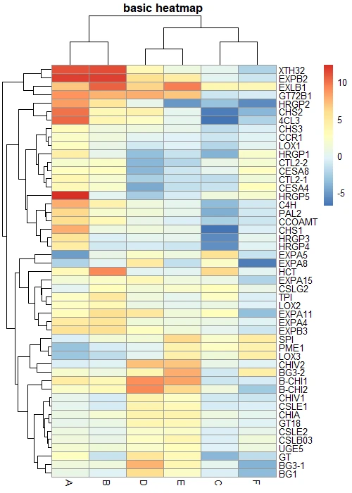
Create heatmap
Basic heatmap
You can create a basic clustered heatmap using the pheatmap. You need to pass the data matrix to the pheatmap() function.
pheatmap(df_mat, main = "basic heatmap")
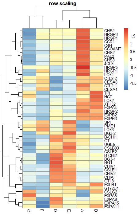
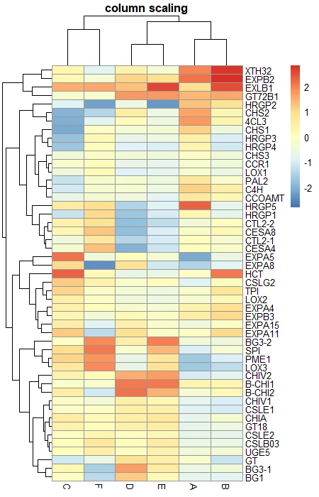
Scale heatmap
pheatmap provides a parameter scale to rescale the default values in column or row direction. The rescaling is useful
when the values in the dataset are very different from each other. For example, some gene expression values are very high
and some are very low.
# row scaling
pheatmap(df_mat, scale = "row", main = "row scaling")

# column scaling
pheatmap(df_mat, scale = "column", main = "column scaling")
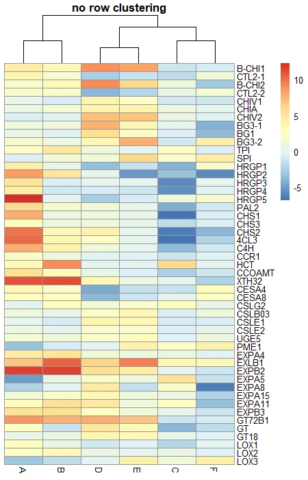
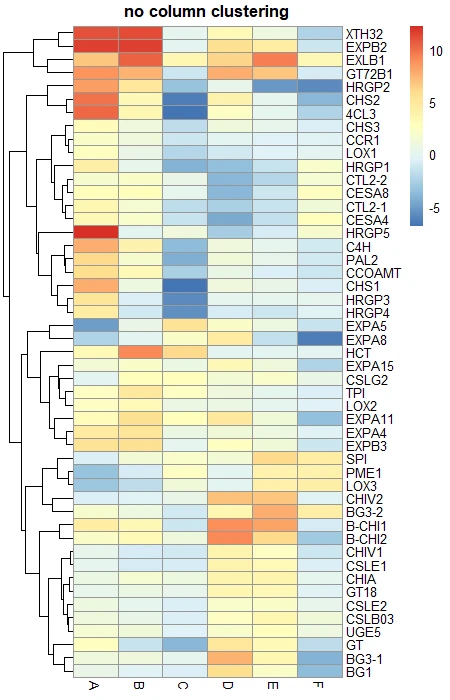
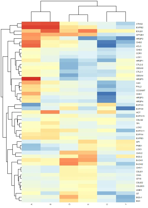
Row and column clustering
By default, pheatmap applies hierarchical clustering to both rows and columns. You can choose if you want to display row/columns
clustering or not by using cluster_rows and cluster_cols options.
# No row clustering
pheatmap(df_mat, cluster_rows = FALSE, main = "no row clustering")

# No column clustering
pheatmap(df_mat, cluster_cols = FALSE, main = "no column clustering")
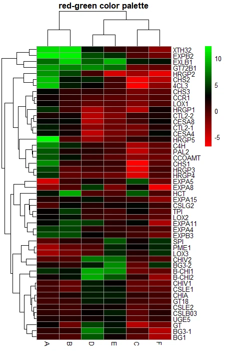
Color palette
You can change the color palette of the heatmap using the colorRampPalette() function, which returns a fixed number of
colors.
# green and red color palette
color <- colorRampPalette((c("red", "black", "green")))(50)
pheatmap(df_mat, color = color, main = "red-green color palette")

# blue and green color palette
color <- colorRampPalette((c("blue", "black", "red")))(50)
pheatmap(df_mat, color = color, main = "blue-red color palette")

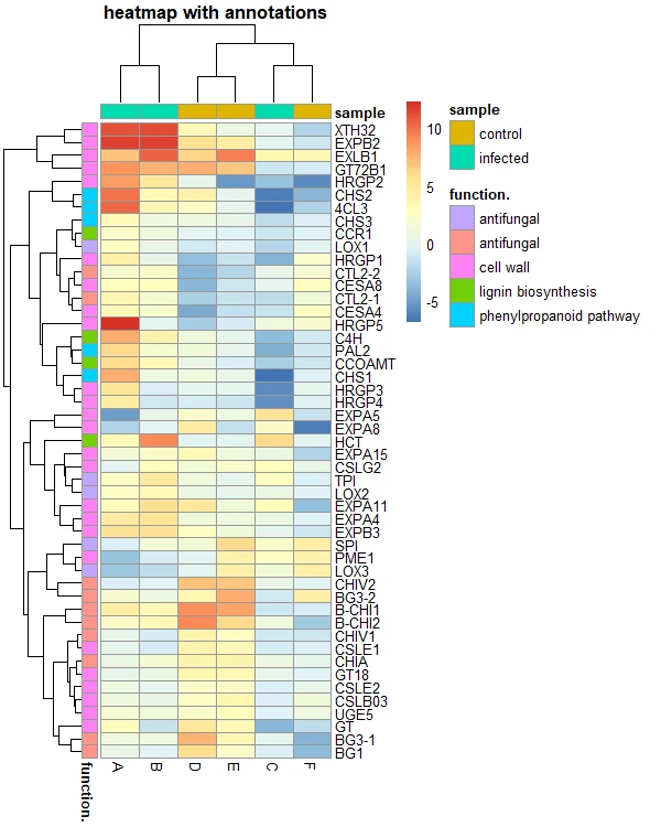
Add annotations
You can add annotations to the row and columns to enhance the informative visualization for the heatmap. For example, you can add an annotation to a group of genes involved in the same biological pathway or you can add an annotation to the samples based on their conditions.
Here, I will add an annotation to genes (row) and samples (column) based on their gene functions and conditions.
# create a data frame for column annotation
smaple_group <- data.frame(sample = rep(c("infected", "control"), c(3, 3)))
row.names(smaple_group) <- colnames(df_mat)
# view data frame
smaple_group
    sample
A infected
B infected
C infected
D  control
E  control
F  control

# create a data frame for row annotation
gene_functions = read.csv("https://reneshbedre.github.io/assets/posts/heatmap/hmap_gene_functions.csv", row.names="Gene")
# view data frame
head(gene_functions)
         function.
B-CHI1 antifungal
CTL2-1 antifungal
B-CHI2 antifungal
CTL2-2 antifungal
CHIV1  antifungal
CHIA   antifungal

# heatmap with annotations
pheatmap(df_mat, annotation_row = gene_functions, annotation_col = smaple_group,
         main = "heatmap with annotations")
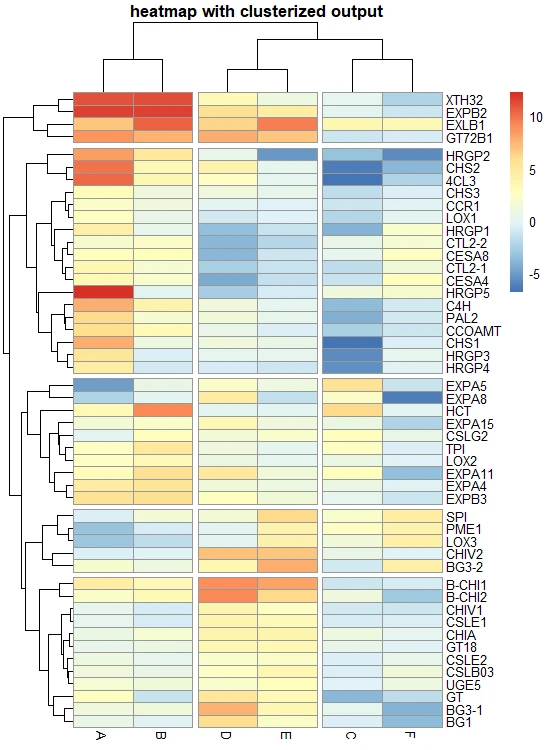
Split heatmap clusters
pheatmap provides parameters cutree_rows and cutree_cols to split the rows and columns based on the number of
cluster. If you can visually see distinct clusters, you can provided that numbers to these paramaters. For example, for columns
I can see three distinct clusters.
# heatmap with cluster break
pheatmap(df_mat, cutree_rows = 5, cutree_cols = 3, main = "heatmap with clusterized output")
Get the heatmap data belonging to each row cluster,
# get data that belong to row clusters
hm <- pheatmap(df_mat)
df_row_cluster = data.frame(cluster = cutree(hm$tree_row, k = 5))
# view the genes clsuters
head(df_row_cluster)
       cluster
B-CHI1       1
CTL2-1       2
B-CHI2       1
CTL2-2       2
CHIV1        1
CHIA         1
Get the heatmap data belonging to each column cluster,
# get data that belong to column clusters
hm <- pheatmap(df_mat)
df_col_cluster = data.frame(cluster = cutree(hm$tree_col, k = 3))
# view the genes clsuters
head(df_col_cluster)
 cluster
A       1
B       1
C       2
D       3
E       3
F       2
Add gaps in the heatmap
In pheatmap, you can add gaps in heatmap between specific columns or rows to separate the heatmap. For example, you can add gaps to differentiate the heatmaps by the functional significance of the genes.
# add gap between 2-3 and 4-5 columns
pheatmap(df_mat, gaps_col = c(2, 4), gaps_row = c(5), cluster_cols = FALSE, cluster_row = FALSE,
         border_color = FALSE, main = "heatmap with row and column gap")
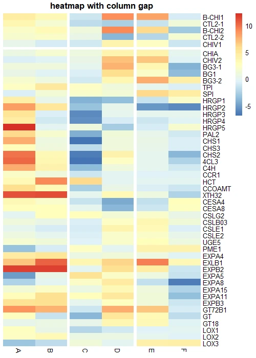
Tip: If you would like to enable gaps in heatmaps, you must off row and column clustering
Other parameters
In addition to the above function, you can also control other aesthetic parameters to control the fonts, border,
# heatmap with annotations
pheatmap(df_mat,
         border_color = FALSE,      # no border to cell
         fontsize_row = 5,          # row label font size
         fontsize_col = 5,          # column label font size
         angle_col = 90,             # angle for column labels
         width = 5,                 # plot width in inches
         height = 7,                # plot height in inches
         na_col = "black",           # color of the cell with NA values
         legend = FALSE,            # to draw legend or not (TRUE/FALSE)
         filename = "heatmap.png"   # file name with path to save the heatmap
)
Tip: If you save an image using the
filenameparameter, usedev.off()to close the plotting device
Related: ComplexHeatmap: Create Complex Heatmaps in R
Enhance your skills with courses on genomics and bioinformatics
- Genomic Data Science Specialization
- Biology Meets Programming: Bioinformatics for Beginners
- Bioinformatics Specialization
- Command Line Tools for Genomic Data Science
- Introduction to Genomic Technologies
This work is licensed under a Creative Commons Attribution 4.0 International License
Some of the links on this page may be affiliate links, which means we may get an affiliate commission on a valid purchase. The retailer will pay the commission at no additional cost to you.