MA plot to visualize gene expression data using Python
What is MA plot?
- MA plot is a 2-dimensional (2D) scatter plot used for visualizing gene expression datasets
- MA plot visualize and identify gene expression changes from two different conditions (e.g. normal vs. treated) in terms of log fold change (M) on Y-axis and log of the mean of normalized expression counts of two conditions on X-axis. Generally, genes with lower mean expression values will have highly variable log fold changes.
- Genes with similar expression values in both normal and treated samples will cluster around M=0 value i.e genes expressed with no significant differences in between treatments
- Points away from M=0 line indicate genes with significant expression, For example, a gene is upregulated and downregulated if the point is above and below M=0 line respectively
- MA plot does not consider statistical measures (p values or adjusted p values) and therefore we can not tell genes with statistically significant differences between normal vs. treated from MA plot (Use Volcano plot if you want indicates genes with statistically significant differences)
How to create MA plot in Python?
- We will use
bioinfokit v2.0.7or later - Check bioinfokit documentation for installation and documentation
- For generating the MA plot, I have used gene expression data published in Bedre et al. 2016 to identify statistically significantly induced or downregulated genes in response to salt stress in Spartina alterniflora (Read paper). Here’s you can download gene expression dataset used for generating MA plot: dataset
Note: If you have your own dataset, you should import it as pandas dataframe. Learn how to import data using pandas
from bioinfokit import analys, visuz
# load dataset as pandas dataframe
df = analys.get_data('ma').data
df.head(2)
GeneNames value1 value2 log2FC p-value
0 LOC_Os09g01000.1 8862 32767 -1.886539 1.250000e-55
1 LOC_Os12g42876.1 1099 117 3.231611 1.050000e-55
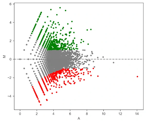
visuz.GeneExpression.ma(df=df, lfc='log2FC', ct_count='value1', st_count='value2', pv='p-value')
# plot will be saved in same directory (ma.png)
# set parameter show=True, if you want view the image instead of saving
Generated MA plot by adding above code (green: upregulated and red: downregulated genes),
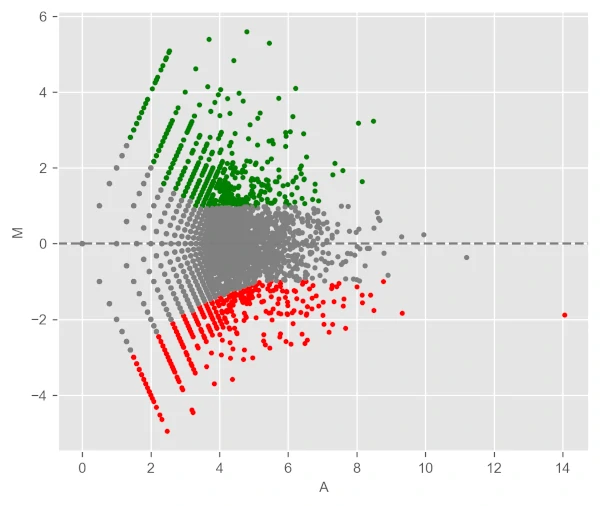
Change background theme to ggplot,
visuz.GeneExpression.ma(df=df, lfc='log2FC', ct_count='value1', st_count='value2', pv='p-value', theme='ggplot')
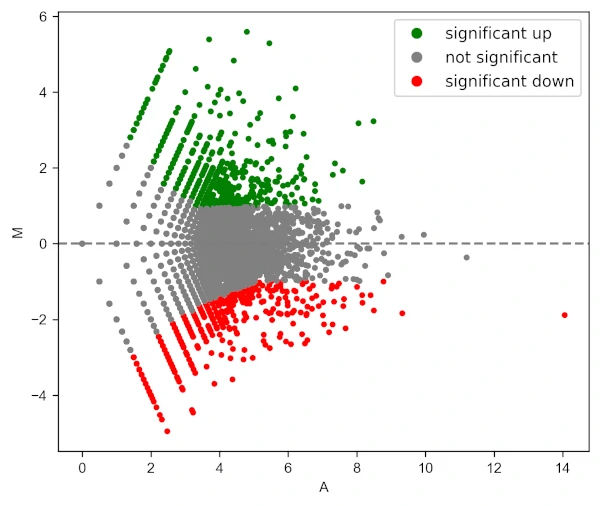
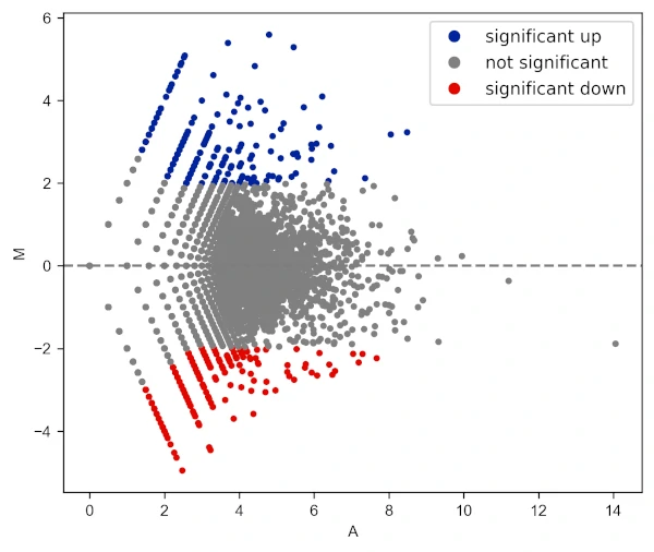
Add legend to the plot,
visuz.GeneExpression.ma(df=df, lfc='log2FC', ct_count='value1', st_count='value2', pv='p-value', plotlegend=True)
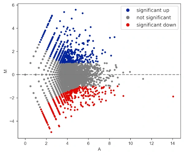
Change color of MA plot
# change colormap
visuz.GeneExpression.ma(df=df, lfc='log2FC', ct_count='value1', st_count='value2', pv='p-value', plotlegend=True,
    color=('#00239CFF', 'grey', '#E10600FF'))
Change log fold change threshold for up and downregulated genes,
visuz.GeneExpression.ma(df=df, lfc='log2FC', ct_count='value1', st_count='value2', pv='p-value', lfc_thr=(2,2),
    plotlegend=True, color=('#00239CFF', 'grey', '#E10600FF'))
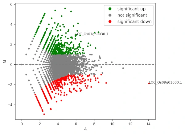
Add gene labels (text style) to the points,
visuz.GeneExpression.ma(df=df, lfc='log2FC', ct_count='value1', st_count='value2', pv='p-value', plotlegend=True,
                        geneid="GeneNames", genenames=("LOC_Os09g01000.1", "LOC_Os01g50030.1"))
# see more parameters to control adding labels in usage here https://github.com/reneshbedre/bioinfokit#ma-plot
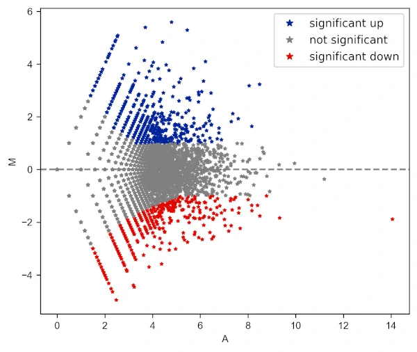
Change the shape of the points
# add star shape
# check more shapes at https://matplotlib.org/3.1.1/api/markers_api.html
visuz.GeneExpression.ma(df=df, lfc='log2FC', ct_count='value1', st_count='value2', pv='p-value',
                        color=('#00239CFF', 'grey', '#E10600FF'), markerdot='*', plotlegend=True)
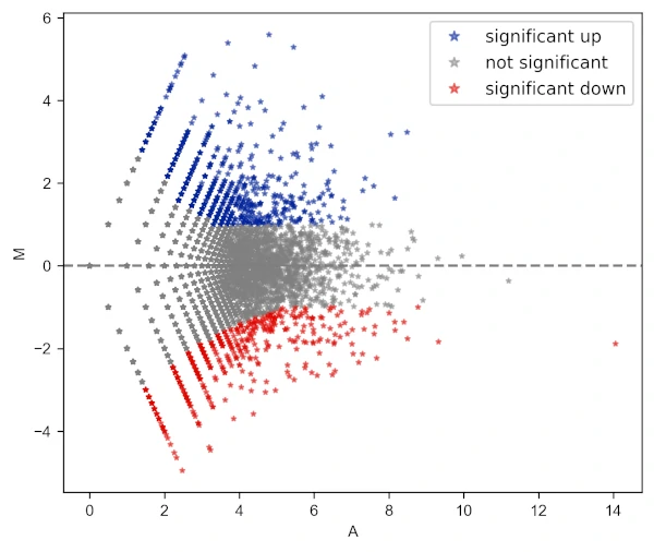
Change the transparency of the points
# add star shape
# check more shapes at https://matplotlib.org/3.1.1/api/markers_api.html
visuz.GeneExpression.ma(df=df, lfc='log2FC', ct_count='value1', st_count='value2', pv='p-value',
                        color=('#00239CFF', 'grey', '#E10600FF'), markerdot='*', valpha=0.5, plotlegend=True)
Draw log fold change threshold lines
# change colormap
visuz.GeneExpression.ma(df=df, lfc='log2FC', ct_count='value1',  st_count='value2', pv='p-value',
                        color=('#00239CFF', 'grey', '#E10600FF'), fclines=True, plotlegend=True)

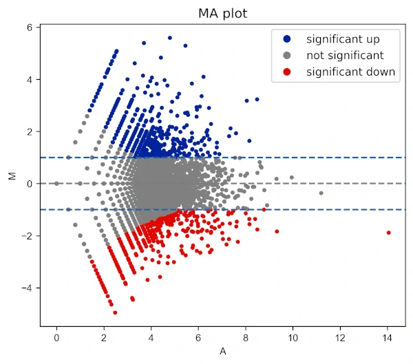
Add title to the plot,
# change colormap
visuz.GeneExpression.ma(df=df, lfc='log2FC', ct_count='value1',  st_count='value2', pv='p-value',
                        color=('#00239CFF', 'grey', '#E10600FF'), fclines=True, plotlegend=True, title='MA plot')
Change X and Y range ticks, font size and name for tick labels
visuz.GeneExpression.ma(df=df, lfc='log2FC', ct_count='value1', st_count='value2', pv='p-value', color=('#00239CFF', 'grey', '#E10600FF'),
    markerdot='*', figtype='svg', xlm=(0,16,1), ylm=(-6,6,1), axtickfontsize=10, axtickfontname='Verdana', plotlegend=True)

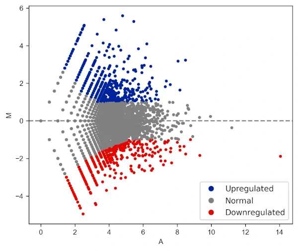
Change legend position and labels
visuz.GeneExpression.ma(df=df, lfc='log2FC', ct_count='value1', st_count='value2', pv='p-value', color=('#00239CFF', 'grey', '#E10600FF'),
    plotlegend=True, legendpos='lower right', legendlabels=['Upregulated', 'Normal', 'Downregulated'])
In addition to these parameters, the parameters for figure type (figtype), X and Y axis ticks range (xlm, ylm), axis labels (axxlabel, axylabel),
axis labels font size and name (axlabelfontsize, axlabelfontname), and axis tick labels font size and name (axtickfontsize, axtickfontname)
can be provided.
Check detailed usage
If you have any questions, comments or recommendations, please email me at reneshbe@gmail.com
This work is licensed under a Creative Commons Attribution 4.0 International License