Violin plot in Python (using seaborn and matplotlib)
Violin plot is a combination of density plot and box plot. Violin plots are useful for displaying frequency distributions and data variations. Violin plot is the best alternative to a box plot.
In the violin plot, the density plot is symmetrical along the axis of the box plot. The width of the density plot represents the frequency of the data. The higher the width, the higher the frequency of that value in that bin. The inner box plot in violin plot represents the variation in the data distribution (like minimum maximum, median, and quartile values).
Compared to box plots, violin plots are more informative since they visualize the variation in data as well as frequency distributions. Violin plots are extremely useful in the comparative visualization of distributions of quantitative data among several groups of categorical variables.
Violin plot in Python
This article explains how to create a violin plot using seaborn Python package. The basic syntax for plotting a violin plot using seaborn is as follows,
seaborn.violinplot(data=df, x='col1', y='col2', hue='col3')
- data: pandas DataFrame or arrays
- x, y, hue: Inputs for plotting long format data
In addition to these basic parameters, seaborn.violinplot() functions also accept
other parameters for customizing the violin plot.
The following examples demonstrate creating violin plots from Pandas DataFrames for single and multiple groups
Violin plot for single group
Create vertical and horizontal violin plot for single group,
import pandas as pd
import seaborn as sns
import matplotlib.pyplot as plt

# load example dataset
df = pd.read_csv('https://reneshbedre.github.io/assets/posts/violin/genotype.csv')

# view first two rows of dataset
df.head(2)
# output
  plant_var location  height   yield
0         A       L1       12     55
1         A       L2       11     45

# create violin plot for height (horizontal)
sns.violinplot(data=df, x="height")
plt.show()

# create violin plot for height (vertical)
sns.violinplot(data=df, y="height")
plt.show()
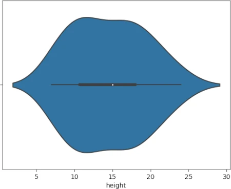
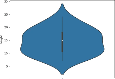
Note: Based on the type of input variable, the seaborn violin plot can create horizontal or vertical plots. You can create a horizontal violin plot by providing quantitative variables as
xparameter. Alternatively, it will create a vertical violin plot if you provide a quantitative variable as theyparameter.
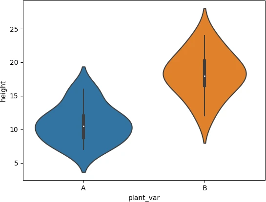
Violin plot for multiple groups
If there is one categorical variable with multiple groups, you can create a violin plot for multiple groups as follows,
import pandas as pd
import seaborn as sns
import matplotlib.pyplot as plt

# load example dataset
df = pd.read_csv('https://reneshbedre.github.io/assets/posts/violin/genotype.csv')

sns.violinplot(data=df, x='plant_var', y='height')
plt.show()
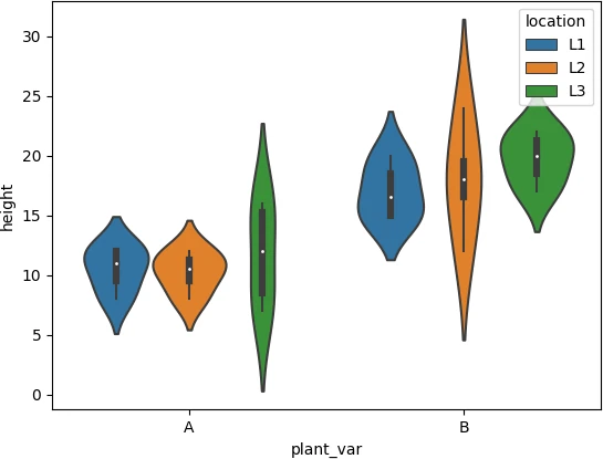
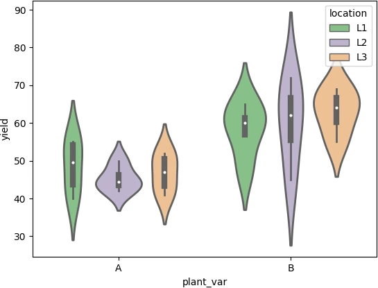
Grouped violin plot
If there are multiple categorical variables in a DataFrame, you can create a grouped violin plot using the hue parameter as
follows,
import pandas as pd
import seaborn as sns
import matplotlib.pyplot as plt

# load example dataset
df = pd.read_csv('https://reneshbedre.github.io/assets/posts/violin/genotype.csv')

sns.violinplot(data=df, x='plant_var', y='height', hue='location')
plt.show()
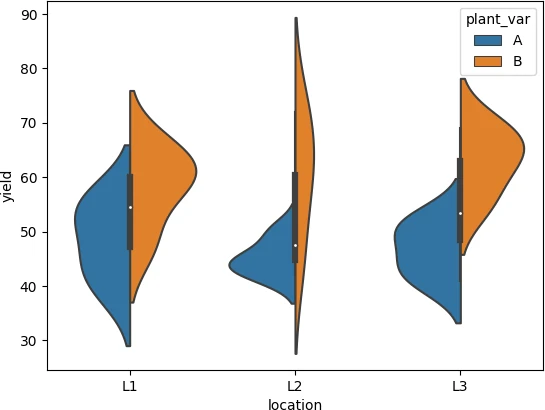
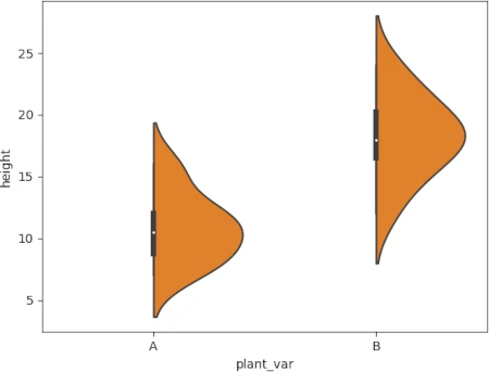
Grouped and split (asymmetric) violin plot
When you plot grouped violin plot, it may take more space on the graph. In this case, the split parameter is useful for
plotting grouped violin plots.
The splitted violin plot is asymmetric around the bar plot axis and takes less space on the graph (compare it with above grouped violin plot). There must be two categorical variables to split the violin plot.
import pandas as pd
import seaborn as sns
import matplotlib.pyplot as plt

# load example dataset
df = pd.read_csv('https://reneshbedre.github.io/assets/posts/violin/genotype.csv')

sns.violinplot(data=df, x='location', y='yield', hue='plant_var', split=True)
plt.show()
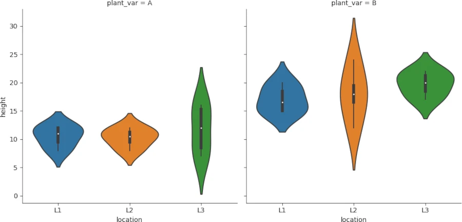
Side-by-side violin plot
To create a side-by-side violin plot for each group, you can use seaborn.catplot() function.
The input pandas DataFrame should be in a long format. If your DataFrame is in a wide format, you should convert it into a long format. You can refer to my article on how to convert wide format DataFrame into a long format.
import pandas as pd
import seaborn as sns
import matplotlib.pyplot as plt

# load example dataset
df = pd.read_csv('https://reneshbedre.github.io/assets/posts/violin/genotype.csv')

sns.catplot(kind='violin', data=df, x='location', y='height', col='plant_var', col_wrap=2)
plt.show()
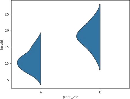
Half violin plot
You can also crate half (one-sided) violin plot with some changes in code,
import pandas as pd
import seaborn as sns
import matplotlib.pyplot as plt

# load example dataset
df = pd.read_csv('https://reneshbedre.github.io/assets/posts/violin/genotype.csv')

# left-sided
ax=sns.violinplot(data=df, x='plant_var', y='height', hue=True, hue_order=[True, False], split=True)
ax.legend_ = None
plt.show()

# right-sided
ax=sns.violinplot(data=df, x='plant_var', y='height', hue=True, hue_order=[False, True], split=True)
ax.legend_ = None
plt.show()
Source: stackoverflow.com
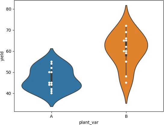
Violin plot with data points
If you want to add data points on the violin plot, you need to use seaborn.swarmplot() function along with violin plot
function as follows,
import pandas as pd
import seaborn as sns
import matplotlib.pyplot as plt

# load example dataset
df = pd.read_csv('https://reneshbedre.github.io/assets/posts/violin/genotype.csv')

sns.violinplot(data=df, x='plant_var', y='yield')
sns.swarmplot(data=df, x='plant_var', y='yield', dodge=True, color= "white")

plt.show()
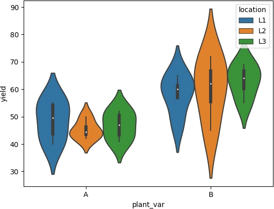
Customized violin plot
The color map of the violin plot can be changed using the palette parameter. You can see this matplotlib page for
various available palettes.
The linewidth of the violin plot can be changed using the linewidth parameter.
See the below example of how to change color and linewidth parameters,
import pandas as pd
import seaborn as sns
import matplotlib.pyplot as plt

# load example dataset
df = pd.read_csv('https://reneshbedre.github.io/assets/posts/violin/genotype.csv')

# create violin plot for height
sns.violinplot(data=df, x='plant_var', y='yield', hue='location', palette='Accent', linewidth=2)
plt.show()
The width of the violin plot can be adjusted using the scale parameter.
The scale of the violin plot changes the width of the violin plot. If scale is set to count, the width of the violin will be scaled to a number of values in that bin.
sns.violinplot(data=df, x='plant_var', y='yield', hue='location', scale='count')
plt.show()
Enhance your skills with courses Python and pandas
- Mastering Data Analysis with Pandas
- Python for Data Analysis: Pandas & NumPy
- Introduction to Data Science in Python
- Python for Everybody Specialization
- Python 3 Programming Specialization
This work is licensed under a Creative Commons Attribution 4.0 International License
Some of the links on this page may be affiliate links, which means we may get an affiliate commission on a valid purchase. The retailer will pay the commission at no additional cost to you.