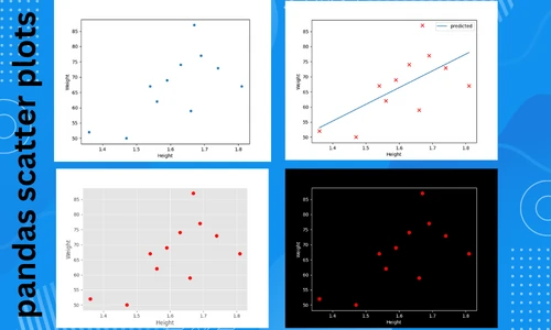
Create a scatter plot using pandas DataFrame (pandas.DataFrame.plot.scatter)
The scatter plot visualizes the relationship between two or three numerical variables by plotting individual data points.
A pairwise scatter plot can be created if you have more than three variables. Scatter plots are useful for visualizing
correlation, clustering, regression, and classification analyses.
In Python, scatter plots are typically created from numerical arrays using the pyplot.scatter() function
available in the matplotlib package. The scatter plots in Pandas, however, allow you to plot directly using columns
from the Dataframe. This tutorial will show you how to create a scatter plot directly from a pandas
DataFrame using a plot.scatter() function.
The plot.scatter()
function takes the following arguments for creating a scatter plot,
- x: column name for plotting data on X-axis
- y: column name for plotting data on Y-axis
- s: the size of the points. It can take a single scalar value or a numerical array
- c: the color of the points (RGB or RGBA code). It can take a single scalar value or multiple values
Now, let’s create a scatter plot using pandasplot.scatter(). We will use students height and weight data for creating a scatter plot. The height and weight variables will be plotted on the X and Y-axis, respectively.
Import the pandas library
Import the pandas library
import pandas as pd
Import the dataset
Import the dataset as pandas DataFrame
df = pd.read_csv('https://reneshbedre.github.io/assets/posts/reg/height.csv')
# view first two rows of dataset
df.head(2)
# output
   Height  Weight
0    1.36      52
1    1.47      50
Create a scatter plot
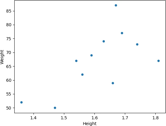
Create a basic scatter plot (with default shape and color),
df.plot.scatter(x = 'Height', y = 'Weight')
plt.show()
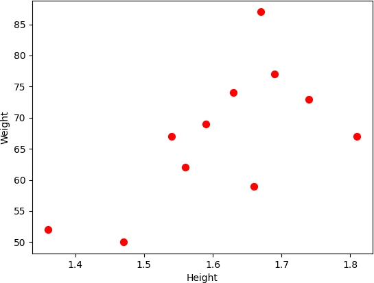
Change the size (s) and colors (c) of the points,
df.plot.scatter(x = 'Height', y = 'Weight', s = 50, c = 'red')
plt.show()
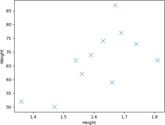
Change marker shape (marker) and transparency (alpha),
df.plot.scatter(x = 'Height', y = 'Weight', s = 100, marker = 'x', alpha = 0.5)
plt.show()
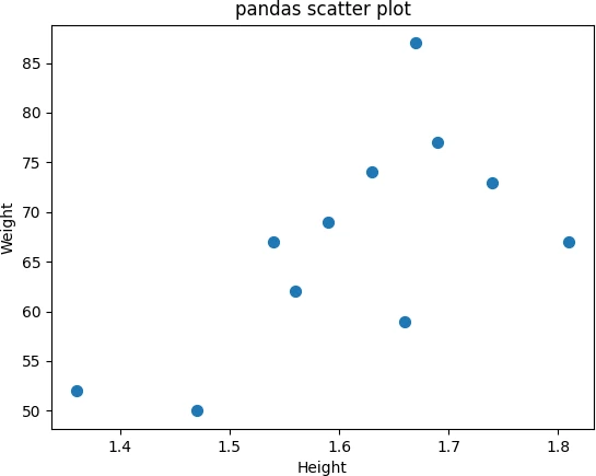
Add a title (title) to pandas scatter plot,
df.plot.scatter(x = 'Height', y = 'Weight', s = 50, title = 'pandas scatter plot')
plt.show()
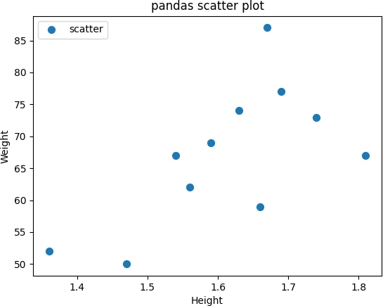
Add legend to pandas scatter plot using plt.legend() function. You
can specify the location of the legend using the loc parameter,
df.plot.scatter(x = 'Height', y = 'Weight', s = 50, title = 'pandas scatter plot', label = 'scatter')
plt.legend(loc = 'upper left')
plt.show()
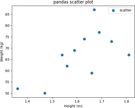
Add X and Y-axis labels to the pandas scatter plot using plt.xlabel() and plt.ylabel() functions,
df.plot.scatter(x = 'Height', y = 'Weight', s = 50, title = 'pandas scatter plot', label = 'scatter')
plt.xlabel('Height (m)')
plt.ylabel('Weight (kg)')
plt.show()
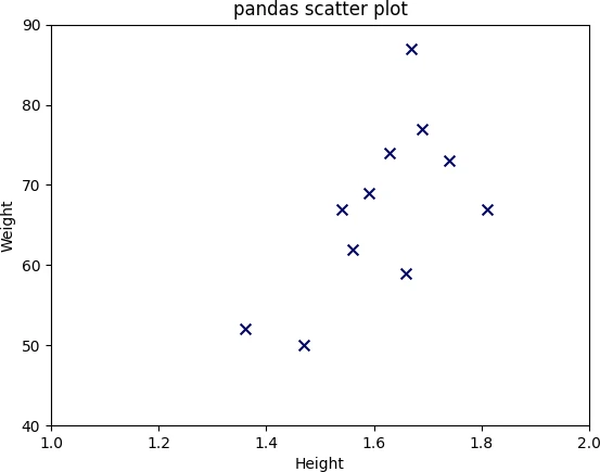
Add X and Y-axis limits to the pandas scatter plot using xlim and ylim functions. You can specify the left
and right range (as shown in code below).
df.plot.scatter(x = 'Height', y = 'Weight', s = 50,  marker = 'x', c = '#030764', title = 'pandas scatter plot')
plt.xlim(1, 2)
plt.ylim(40, 90)
plt.show()
You can also change the style of the pandas scatter plot
using plt.style.use() function. You can either change the background color or the theme of the plot. For example, create
a dark background and ggplot style scatter plot,
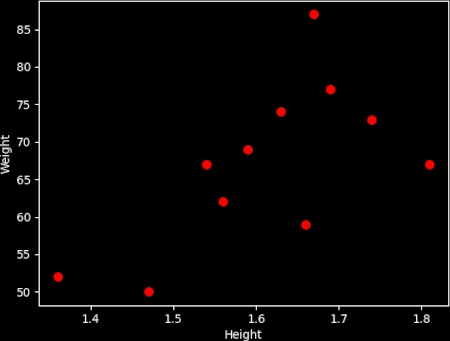
# dark background
plt.style.use('dark_background')
df.plot.scatter(x = 'Height', y = 'Weight', s = 50, c = 'red')
plt.show()
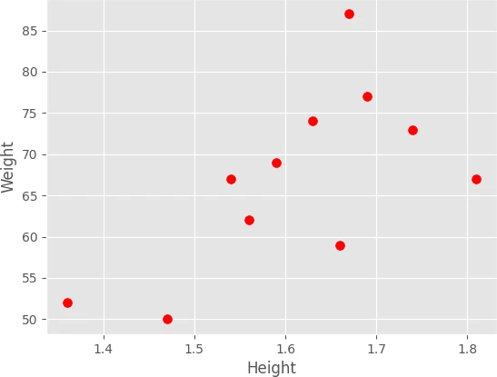
# ggplot style
plt.style.use('ggplot')
df.plot.scatter(x = 'Height', y = 'Weight', s = 50, c = 'red')
plt.show()
If you want switch back to default plotting style, you can use plt.style.use('default') function.
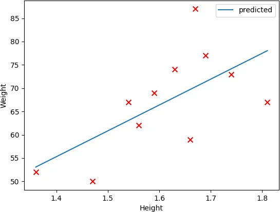
Add a regression line on the scatter plot. First, to get a regression line, we will fit the model using the sklearn LinearRegression()
function and then plot a fitted line on a scatter plot.
from sklearn.linear_model import LinearRegression
import numpy as np

X = np.array(df['Height']).reshape(-1, 1)
y = np.array(df['Weight'])
# fit the model
reg = LinearRegression().fit(X, y)
df['predicted'] = reg.predict(X)

fig, ax = plt.subplots()
df.plot.scatter(x = 'Height', y = 'Weight', s = 50,  marker = 'x', c = 'red', ax = ax)
df.plot.line(x = 'Height', y = 'predicted', ax = ax)
plt.show()
In summary, you learned how to create a pandas scatter plot on DataFrame using pandas plot.scatter() function. You
can learn how to create a line plot in Pandas by reading this article.
Enhance your skills with courses Python and pandas
- Mastering Data Analysis with Pandas
- Python for Data Analysis: Pandas & NumPy
- Introduction to Data Science in Python
- Python for Everybody Specialization
- Python 3 Programming Specialization
This work is licensed under a Creative Commons Attribution 4.0 International License
Some of the links on this page may be affiliate links, which means we may get an affiliate commission on a valid purchase. The retailer will pay the commission at no additional cost to you.