How to Plot ROC Curve in Python
The Receiver Operating Characteristic (ROC) curve is a graphical plot for evaluating the performance of binary classification models such as logistic regression, support vector machines, etc.
ROC curve visualizes the trade-off between sensitivity (true positive rate) and specificity (false positive rate) for all possible threshold values.
A model with good predictability will have ROC curve that extends towards the upper-left corner of the plot (high true positive rate and
low false positive rate). A perfect prediction model will have an ROC curve with true positive rate (TPR) = 1 and
false positive rate (FPR) = 0.
In addition, the ROC curve summarises the model predictability based on the area under the ROC curve (AUC). AUC ranges from 0 to 1, and a model with higher a AUC (close to 1) has higher predictability.
In Python, the ROC curve can be plotted using the roc() function from the bioinfokit
package.
We will take the example of the logistic regression to plot the ROC curve in Python.
Getting the dataset
We will use the sample breast cancer dataset for fitting the logistic regression model.
This sample breast cancer dataset includes four features (predictors) and outcome [patient is healthy (0) or cancerous (1)].
# import package
import pandas as pd

# load dataset
df = pd.read_csv("https://reneshbedre.github.io/assets/posts/logit/breast_cancer_sample_2.csv")

# view first few rows
# Classification is the outcome with two levels with cancer (1) or healthy (0) patients
df.head(2)
  Age        BMI  Insulin  Leptin  Classification
0   48  23.500000    2.707  8.8071               0
1   83  20.690495    3.115  8.8438               0
Train-Test split
Split the dataset into train and test datasets. We will use the train_test_split() function from the sklearn package to
split 70% as training and 30% as test datasets.
The training dataset will be used for training the model and the test dataset will be used for prediction.
# import package
from sklearn.model_selection import train_test_split

# split into training and testing
df_train, df_test = train_test_split(df, train_size = 0.7, random_state = 0)
Fit the logistic regression model and perform prediction
Fit the logistic regression model using training dataset,
# import package
from sklearn.linear_model import LogisticRegression

# get X and y
X_train = df_train[["Age", "BMI", "Insulin", "Leptin"]]
y_train = df_train["Classification"]

# fit the model
fit = LogisticRegression(random_state = 0).fit(X_train, y_train)

# perform prediction
# get X and y
X_test = df_test[["Age", "BMI", "Insulin", "Leptin"]]
y_test = df_test["Classification"]

# calculate predicted probabilities
pred_probs = fit.predict_proba(X_test)[:, 1]
Plot ROC curve
We will use the roc() function from the bioinfokit to plot the ROC curve. ROC plot requires TPR (sensitivity) and
FPR (specificity) values.
Calculate TPR and FPR for ROC,
# import package
from sklearn.metrics import roc_curve, roc_auc_score

# calculate FPR and TPR and AUC
fpr, tpr, thresholds = roc_curve(y_true = y_test, y_score = pred_probs)
auc = roc_auc_score(y_true = y_test, y_score = pred_probs)
Now, plot the ROC curve,
# import package
from bioinfokit.visuz import stat

# plot ROC
stat.roc(fpr = fpr, tpr = tpr, auc = auc, shade_auc = True, per_class = True,
         legendpos='upper center', legendanchor=(0.5, 1.08), legendcols=3)
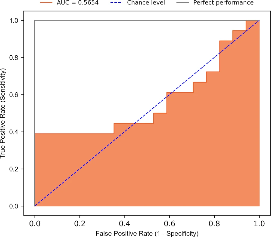
Based on the ROC curve and AUC (0.56), the model has poor predictability. The model will not perform well in classifying the healthy and cancer patients.
Related: Calculate AUC in Python
Enhance your skills with courses on machine learning
- Advanced Learning Algorithms
- Machine Learning Specialization
- Machine Learning with Python
- Machine Learning for Data Analysis
- Supervised Machine Learning: Regression and Classification
- Unsupervised Learning, Recommenders, Reinforcement Learning
- Deep Learning Specialization
- AI For Everyone
- AI in Healthcare Specialization
- Cluster Analysis in Data Mining
This work is licensed under a Creative Commons Attribution 4.0 International License
Some of the links on this page may be affiliate links, which means we may get an affiliate commission on a valid purchase. The retailer will pay the commission at no additional cost to you.