How to Plot ROC Curve in R
The Receiver Operating Characteristic (ROC) curve is a graphical plot for evaluating the performance of binary classification models such as logistic regression, support vector machines, etc.
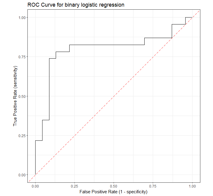
ROC curve visualizes the trade-off between sensitivity (true positive rate) and specificity (false positive rate) for all possible threshold values.
A model with good predictability will have ROC curve that extends towards the upper-left corner of the plot (high true positive rate and
low false positive rate). A perfect prediction model will have an ROC curve with true positive rate (TPR) = 1 and
false positive rate (FPR) = 0.
In R, the ROC curve can be plotted using the roc_curve() function from the yardstick
package.
Let’s take the example of the logistic regression to plot the ROC curve in R
Fit the logistic regression model using the sample breast cancer dataset. This dataset contains the four features and the response (whether the patient is cancerous or healthy).
# load data
train_df <- read.csv("https://reneshbedre.github.io/assets/posts/logit/breast_cancer_sample.csv")

# view first few rows
# diagnosis is a target variable with two levels with cancer (1) or healthy (0) patients
 Age      BMI Glucose Insulin diagnosis
1  48 23.50000      70   2.707         0
2  83 20.69049      92   3.115         0

# fit logistic regression model
fit = glm(diagnosis ~ Age + BMI + Glucose + Insulin, family = binomial(), data = train_df)
Perform the prediction on test dataset using the fitted model,
# load test dataset
test_df <- read.csv("https://reneshbedre.github.io/assets/posts/logit/breast_cancer_sample_test.csv")

# view first few rows
head(test_df, 2)
  Age   BMI Glucose Insulin diagnosis
1  75 23.00      83   4.952         0
2  34 21.47      78   3.469         0

# perform prediction
pred_probs <- predict(fit, test_df, type = "response")
Plot the ROC curve,
# load packages
library(yardstick)
library(ggplot2)
library(dplyr)

# create a data frame of truth value and predicted probabilities
roc_df <- data.frame(test_df$diagnosis, pred_probs)
colnames(roc_df) <- c("truth", "pred_probs")
roc_df$truth <- as.factor(roc_df$truth)

# plot ROC
roc_curve(roc_df, truth, pred_probs, event_level = "second") %>%
    ggplot(aes(x = 1 - specificity, y = sensitivity)) +
    geom_path() +
    geom_abline(lty = 5, col = "red") +
    coord_equal() +
    xlab("False Positive Rate (1 - specificity)") +
    ylab("True Positive Rate (sensitivity)") +
    ggtitle("ROC Curve for binary logistic regression") +
    theme_bw()
Note: In
roc_curve(), theevent_leveldescribes the event of interest in the target variable (diagnosis). By default, it uses the first level as an event of interest.
Related: Calculate AUC in R
Enhance your skills with courses on machine learning
- Advanced Learning Algorithms
- Machine Learning Specialization
- Machine Learning with Python
- Machine Learning for Data Analysis
- Supervised Machine Learning: Regression and Classification
- Unsupervised Learning, Recommenders, Reinforcement Learning
- Deep Learning Specialization
- AI For Everyone
- AI in Healthcare Specialization
- Cluster Analysis in Data Mining
This work is licensed under a Creative Commons Attribution 4.0 International License
Some of the links on this page may be affiliate links, which means we may get an affiliate commission on a valid purchase. The retailer will pay the commission at no additional cost to you.