Create scatter plots using Python (matplotlib pyplot.scatter)
What is scatter plot?
Scatter plot (Scatter graph) represents the plot of individual data points to visualize the relationship between two (2D) or three (3D) numerical variables.
Scatter plots are used in numerous applications such as correlation and clustering analysis for exploring the relationship among the variables. For example, in correlation analysis, scatter plots are used to check if there is a positive or negative correlation between the two variables.
How to draw a scatter plot in Python (matplotlib)?
In this article, scatter plots will be created from numerical arrays and pandas DataFrame using the
pyplot.scatter() function available in matplotlib package. In addition, you can also use pandas plot.scatter() function
to create scatter plots on pandas DataFrame.
Create basic scatter plot (2D)
For this tutorial, you need to install NumPy, matplotlib, pandas, and sklearn Python packages. Learn how to
install python packages
Get dataset
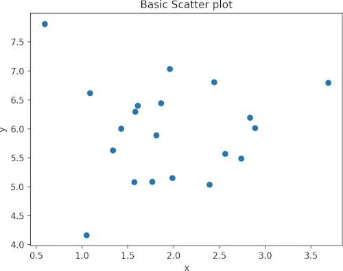
First, create a random dataset,
import numpy as np

x = np.random.normal(size=20, loc=2)
y = np.random.normal(size=20, loc=6)
Draw scatter plot
import matplotlib.pyplot as plt

plt.scatter(x, y)
plt.title('Basic Scatter plot')
plt.xlabel('x')
plt.ylabel('y')
plt.show()
The plt.show() is necessary to visualize the plot. If you like to save the plot to a file, you need to call pyplot.savefig()
function. For example to save plot, use the below command,
plt.savefig("scatterplot.png", dpi=300, format="png")
Check other parameters for pyplot.savefig() here
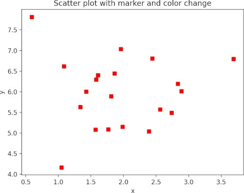
Marker and color
marker and c parameters are used for changing the marker style and colors of the data points. The default marker
style is a circle (defined as o)
Change marker and color of the data point,
plt.scatter(x, y, marker="s", c="r")
plt.title('Scatter plot with marker and color change')
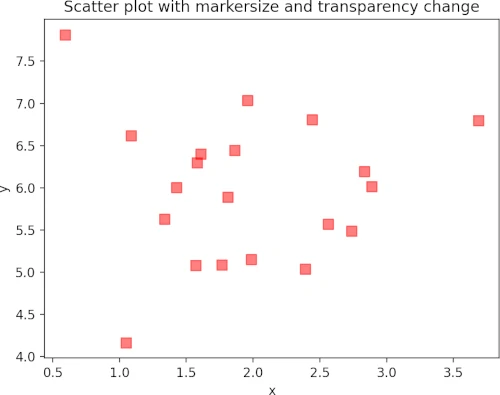
Markersize and transparency
Change the markersize and transparency of data points using s and alpha parameters. The alpha takes a value
between 0 (transparent) and 1 (opaque).
plt.scatter(x, y, marker="s", c="r", s=60, alpha=0.5)
plt.title('Scatter plot with markersize and transparency change')
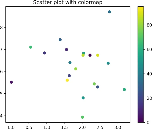
Colormap
The colormap instance can be used to map data values to RGBA color for a given colormap. The colormap option is provided
using the cmap parameter. You also need to pass the c parameter as an array of floats to draw the colormap.
The default colormap is viridis. Get more in-built colormaps here
colors = [*range(0, 100, 5)]
plt.scatter(x, y, c=colors, cmap="viridis")
plt.title('Scatter plot with colormap')
plt.colorbar()
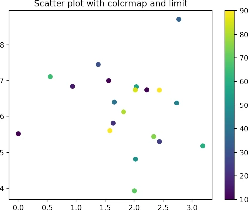
To control the starting and end limits of the colorbar, you can pass vmin and vmax parameters,
colors = [*range(0, 100, 5)]
plt.scatter(x, y, c=colors, vmin=10, vmax=90, cmap="viridis")
plt.title('Scatter plot with colormap and limit')
plt.colorbar()
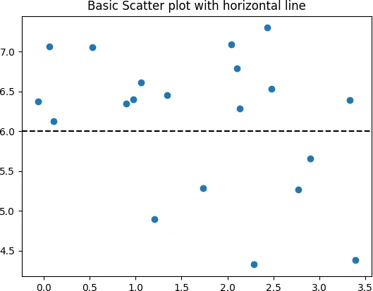
Add horizontal and vertical lines on the scatterplot
The pyplot.axhline() and pyplot.axvline() functions can be used to add horizontal and vertical lines along the
figure axes, respectively.
For horizontal lines, the position on the y-axis should be provided. Additionally, xmin and xmax parameters can also be
used for covering the portion of the figure.
plt.scatter(x, y)
plt.axhline(y=6, color='k', linestyle='dashed')
plt.title('Basic Scatter plot with horizontal line')
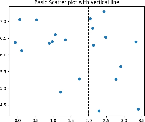
For the vertical line, the position on the x-axis should be provided. Additionally, ymin and ymax parameters can also be
used for covering the portion of the figure.
plt.scatter(x, y)
plt.axvline(x=2, color='k', linestyle='dashed')
plt.title('Basic Scatter plot with vertical line')
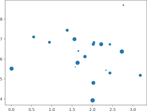
Markersize based on the size of each data point
Change the sizes of the data points using s parameter based on the additional variable of the same length as
x and y,
import random

sizes = random.sample(range(1, 100), 20)
plt.scatter(x, y, s=sizes)
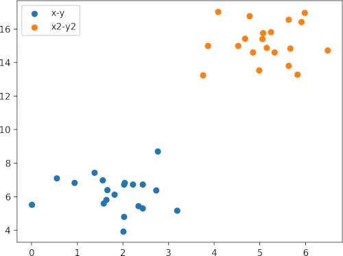
Compare different scatter plots
You can overlay multiple scatterplots in the same plot for visualizing the different datasets
x2 = np.random.normal(size=20, loc=5)
y2 = np.random.normal(size=20, loc=15)

plt.scatter(x, y, label="x-y")
plt.scatter(x2, y2, label="x2-y2")
plt.legend()
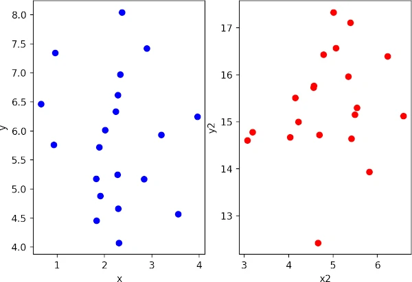
Side by side subplots
You can create two scatter plots (grid of subplots) within a same figure,
fig, (ax1, ax2) = plt.subplots(1, 2)  # 1 row, 2 columns
ax1.scatter(x, y, c='blue')
ax2.scatter(x2, y2, c='red')
ax1.set_xlabel('x')
ax2.set_xlabel('x2')
ax1.set_ylabel('y')
ax2.set_ylabel('y2')
plt.show()
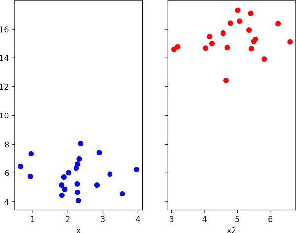
Create two scatter plots (grid of subplots) within a same figure with shared axis,
fig, (ax1, ax2) = plt.subplots(1, 2, sharey=True)  # 1 row, 2 columns
ax1.scatter(x, y, c='blue')
ax2.scatter(x2, y2, c='red')
ax1.set_xlabel('x')
ax2.set_xlabel('x2')
plt.show()
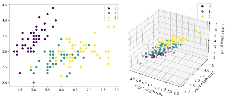
Create scatter plot for multivariate data
The scatter plot can be used for visualizing the multivariate data. I will use the example of the iris dataset which contains the four features, three classes/target (type of iris plant), and 150 observations.
In this example, you will also learn how to create a scatterplot from pandas DataFrame
from sklearn.datasets import load_iris
import pandas as pd
data = load_iris()
# make it as pandas dataframe
df = pd.DataFrame(data=data.data, columns=data.feature_names)
df['target'] = data['target']
df.head(2)
# output
sepal length (cm) sepal width (cm) petal length (cm) petal width (cm) target
0 5.1 3.5 1.4 0.2 0
1 4.9 3.0 1.4 0.2 0
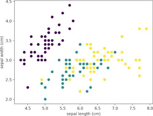
# scatter plot with two features
plt.scatter(df["sepal length (cm)"], df["sepal width (cm)"], c=df["target"])
plt.xlabel('sepal length (cm)')
plt.ylabel('sepal width (cm)')
plt.show()
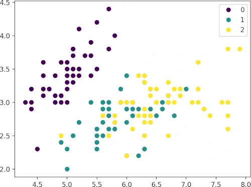
Add target legend,
s = plt.scatter(df["sepal length (cm)"], df["sepal width (cm)"], c=df["target"])
plt.legend(s.legend_elements()[0], list(set(df["target"])))
plt.show()
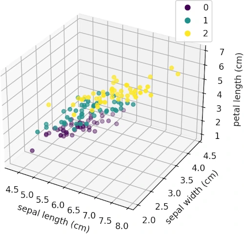
Create 3D scatter plot
Create a 3D scatter plot using three features from the iris dataset. To create a 3D plot, pass the argument
projection="3d" to the Figure.add_subplot function.
fig = plt.figure()
ax = fig.add_subplot(projection='3d')
ax.scatter(df["sepal length (cm)"], df["sepal width (cm)"], df["petal length (cm)"], c=df["target"])
ax.set_xlabel('sepal length (cm)')
ax.set_ylabel('sepal width (cm)')
ax.set_zlabel('petal length (cm)')
plt.legend(s.legend_elements()[0], list(set(df["target"])))
plt.show()
Enhance your skills with courses on Python
- Python for Everybody Specialization
- Python for Data Analysis: Pandas & NumPy
- Mastering Data Analysis with Pandas: Learning Path Part 1
- Data Analysis Using Python
- Machine Learning Specialization
References
If you have any questions, comments or recommendations, please email me at reneshbe@gmail.com
This work is licensed under a Creative Commons Attribution 4.0 International License
Some of the links on this page may be affiliate links, which means we may get an affiliate commission on a valid purchase. The retailer will pay the commission at no additional cost to you.